
UX Design, UI Design, UX Research
Student loan match
Role
UX Design Lead
Start
Jan 2021
Launch
September 2021
Product
Student loan employer benefits platform
00.-
Introduction
By the end of this case study, you’ll see how we implemented a novel, user-centered product offering that supported 6,234 new program participants and disbursed a total of $9.8 million in employer matching contributions to employees’ student loans in 2021. In 2022, projections increased to $16.7 million in employer matching contributions (just from our launch with a single client – the sky's the limit as we launch with more!).
10,000
new eligible users
6,234
program participants in 2021
$9.8 mil
employer matching contributions in 2021 (USD)
$16.7 mil
projected employer matching contributions in 2022 (USD)
01.-
Challenge
Project background & challenge
This project was born out of a request from our student loan benefit product’s largest, most influential client to date, who promised us a pool of about 10,000 eligible users.
The financial benefits technology that I was working on at the time provided a platform for organizations to make direct contributions to their employees’ student loans. This kind of employee benefit, although currently less common than benefits such as tuition reimbursement, has been growing in popularity and stands to give employers a competitive edge, all while serving an unmet need within the American workforce. In the United States, the average amount of student loan debt per borrower was $37,338 for federal loans and $54,921 for private loans, as of the first half of 2023 (
The client was requesting a brand new program type and associated experience that allowed them to match their employees' contributions toward their student loans, up to a customizable cap. I was placed in charge of the UX design of the participant-side interface.
The primary challenge would be to harness a user-centered approach to design, develop and release an entirely new program type for our benefits platform that involved multiple complex flows we had never supported before, such as submission and verification of student loan payment documentation in order for amounts to be matched. While guiding the team through the user-centered design process, I would need to keep everyone aligned on the importance of meeting user needs, while also balancing a variety of client-requested customizations to fit their vision for the program, including two different payout structures, custom messaging and announcements, and more. The solutions for all of these requests needed to be launched by September of 2021, which left me and the team about 8 months to plan, design, user test, iterate, receive compliance approval, implement, QA test, and release the features.
Read on to find out how we were able to implement a top-notch solution on time, and why, in the client's own words, it was "flawlessly executed"!
02.-
Stakeholder kickoffs
Project kickoff & dev collaboration
In an initial kickoff meeting with product, development, and operations stakeholders, the team discussed client and user requirements for MVP, scope, and project timeline. I reached out to the developers and began an open channel of communication dedicated to the project to align on the high level design and development stages that we would be collaboratively following, as well as what would need to be tackled first: The backend infrastructure to support the new processes that the product would be built on.
Although the initial backend development work did not involve user-facing design work, I understood that the way the backend was built would influence the user experience and affordances of the front end. As a result, I attended all of their initial conversations, led collaborative brainstorming sessions, and built a flowchart in real-time depicting the flow of information on the backend, making sure that the user needs, states, and flows were kept top of mind while still maintaining a feasible development approach. We referenced this shared resource throughout the project, keeping us all on the same page.
03.-
Design
Design iterations, round 1
I created a few different design iterations based on this backend flowchart combined with past insights from qualitative research run with our users, competitive research, my UX and visual design expertise, and key use cases/requirements from Product. The most comparable experiences I could find in my competitive search were employer donation matching, tuition reimbursement, and employee expense platforms. Although I used aspects of this competitive research to inspire some of the initial design iterations, the lack of direct competitors and established product processes/patterns meant I had a generally blank canvas to go off of, which both challenged and excited me.
I held a collaborative review session of my first round of designs with the developers and product team to address feasibility and to gather any considerations I may have missed. I presented 2 UX approaches to the developers ranging from lowest development effort to highest development effort. This allowed me to get a pulse-check on which solutions are realistic for us to pursue, ensure that product requirements were being met, and give the developers a voice in the process.
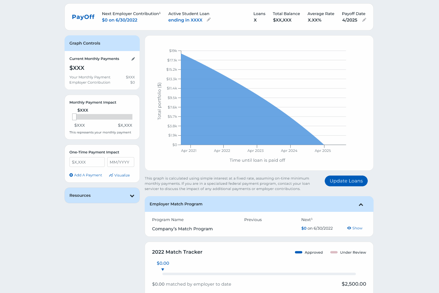
You can see some of the components within these initial, rough iterations below. (When working from scratch, I prefer to go lower-fidelity for first-round design iterations, but due to the ease-of-use of the product’s design system that I had built, I chose to go higher-fidelity with the screens from the start.)
04.-
Research
User research, round 1
The next step was to conduct evaluative user research to understand how our users would approach and make sense of the benefit offering as well as determine which iterations were most usable and identify any pain points and areas for improvement.
Through discussions with developers and peer reviews with product and design stakeholders, I had narrowed down the designs to two, more polished approaches. I created a high-fidelity prototype for each approach and utilized a between-subjects A/B-test study model, where I organized, planned, and moderated 11 think-aloud usability sessions with users of our existing student loan contribution product; 5 of these users were assigned to prototype A, and 6 were assigned to prototype B. I defined the three main goals of the study as: [1] Understand our users' interpretation and approach to the new benefit type, including areas where they may need more clarity and guidance; [2] Compare the usability of each design approach to determine the strongest option, and [3] Help the team decide what needs to be included in MVP vs. what can wait (and for how long).
Participants were all given the same overall scenario and tasks: [1] Upload your first payment document for employer matching; [2] Correct an invalid payment within a past submission; [3] Correct an invalid document within a past submission. These tasks were modeled off of the main actions participants could be expected to complete throughout a student loan contribution matching program – both the happy path and unhappy paths.
Due to the think-aloud nature of the usability sessions, I was able to collect rich qualitative data in the form of participant quotes and themes. I also collected three main quantitative metrics for each task:
- [1] Task completion time, in seconds
- [2] Number of errors (mis-clicks)
- [3] Number of times external help was needed
Additionally, I collected after-scenario Likert scale responses to question 4 of the System Usability Scale, which I reworded slightly for our study: “On a scale of 1 to 5, where 1 is not at all confident and 5 is very confident, how confident are you that you could do this process again on your own?” I chose to include this specific question from the SUS because it addressed product and operations stakeholders’ largest concern around our new “Match” programs prompting an unmanageable influx of new support calls and help messages.
I performed both qualitative thematic analysis and quantitative statistical analysis (summary statistics in Excel and nonparametric inferential statistics that were "safe" for small sample sizes in RStudio). I also put together an effective presentation for dev and product stakeholders where I shared my findings, insights, and suggestions for changes.
05.-
Design
Design iterations, round 2
Based on the user research, I highlighted several main findings and insights:
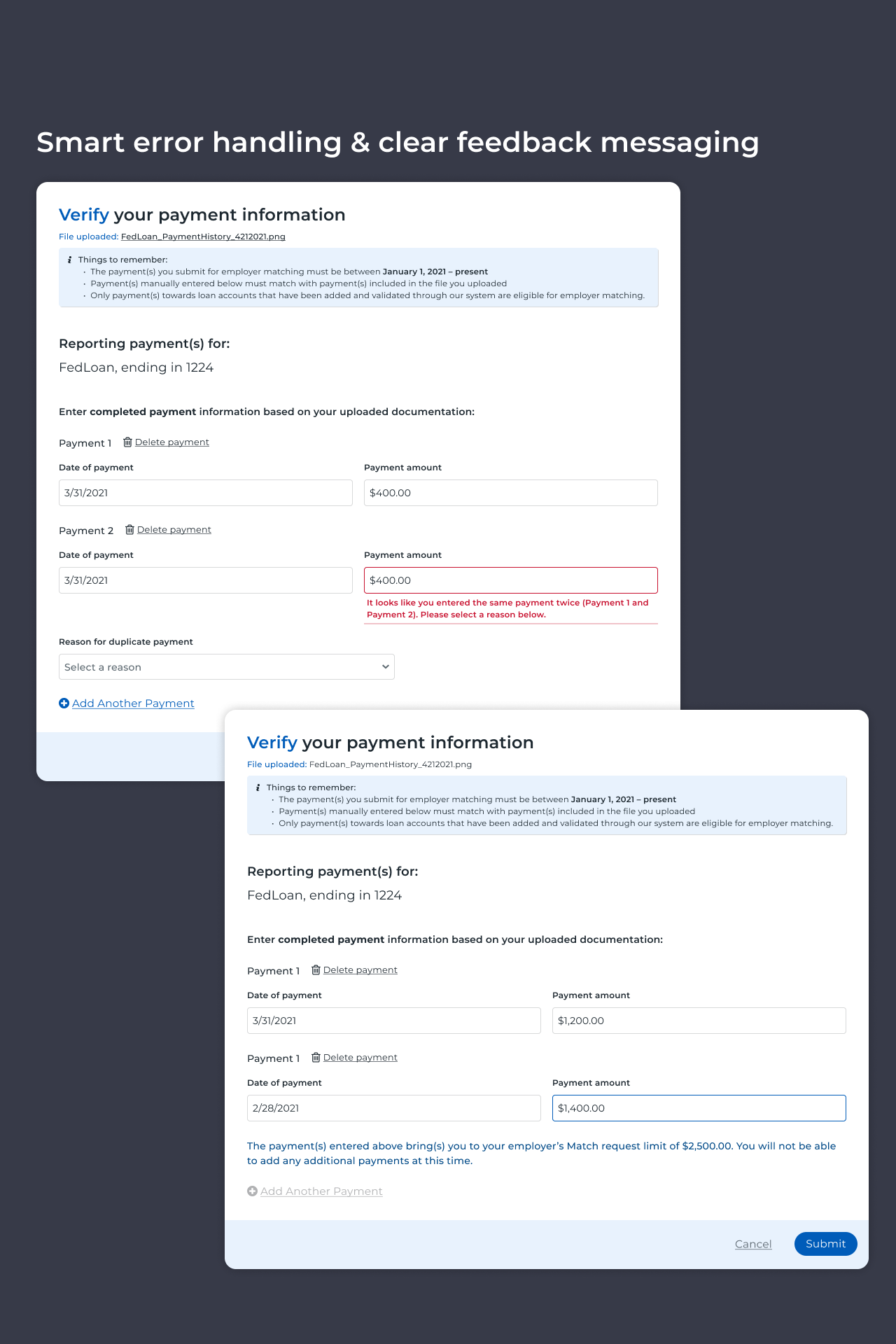
- [1] Requiring manual entry of payment information made user error inevitable. We didn’t have the time or resources to automate the entry of payment information for MVP, but we also didn’t have the time or resources for our operations team to manually handle a flood of user-submitted errors. Solution: We would need to make sure we had foolproof error handling and extremely clear feedback messaging in the case of any user error imaginable.
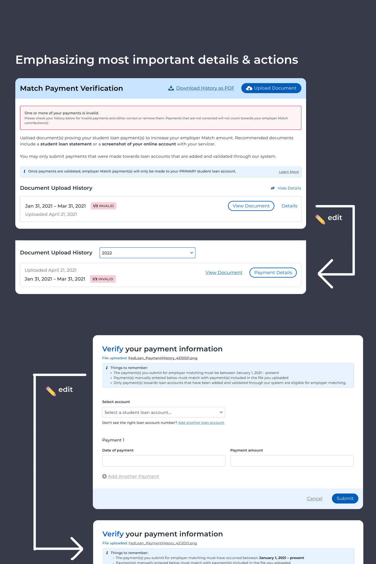
- [2] Users skimmed copy even more than I had expected them to. This led to participants missing important details about the benefits program that would have prevented them from being able to maximize it or manage it effectively in a real-life scenario. Solution: Use text and visual decoration more to highlight the most important benefits program details and the most helpful interface capabilities.
- [3] The inclusion of relevant contextual information that persists with the user can make the submission-correction process much more efficient and less anxiety-inducing. The lack of these contextual details can, on the other hand, lead to an increased cognitive load on the user and more frustrating and anger-inducing interactions. Solution: Make sure important details, such as the original reason for invalidation and reference points such as payment dates, persist throughout the user’s error-correction process so they do not need to shoulder the entire cognitive load themselves.
- [4] Although payment-level and document-level resubmissions were treated differently on our backend, it was a smoother experience for study participants when the correction process was as consistent as possible on their front end. Solution: While it was important for users to be able to figure out the difference between each level of resubmission when starting the submission-correction process, the actual meat of the process should keep things as familiar as possible to them.
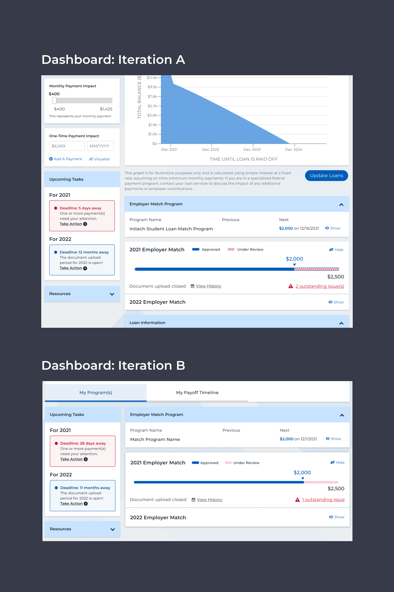
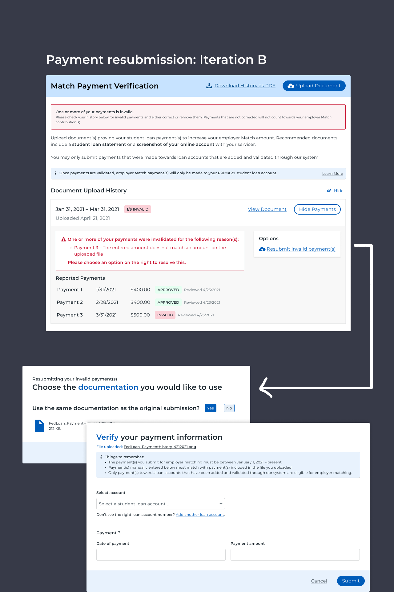
You can find some examples of improvements made to the designs based on these insights below.
06.-
Handoff & launch
Dev handoff and product launch
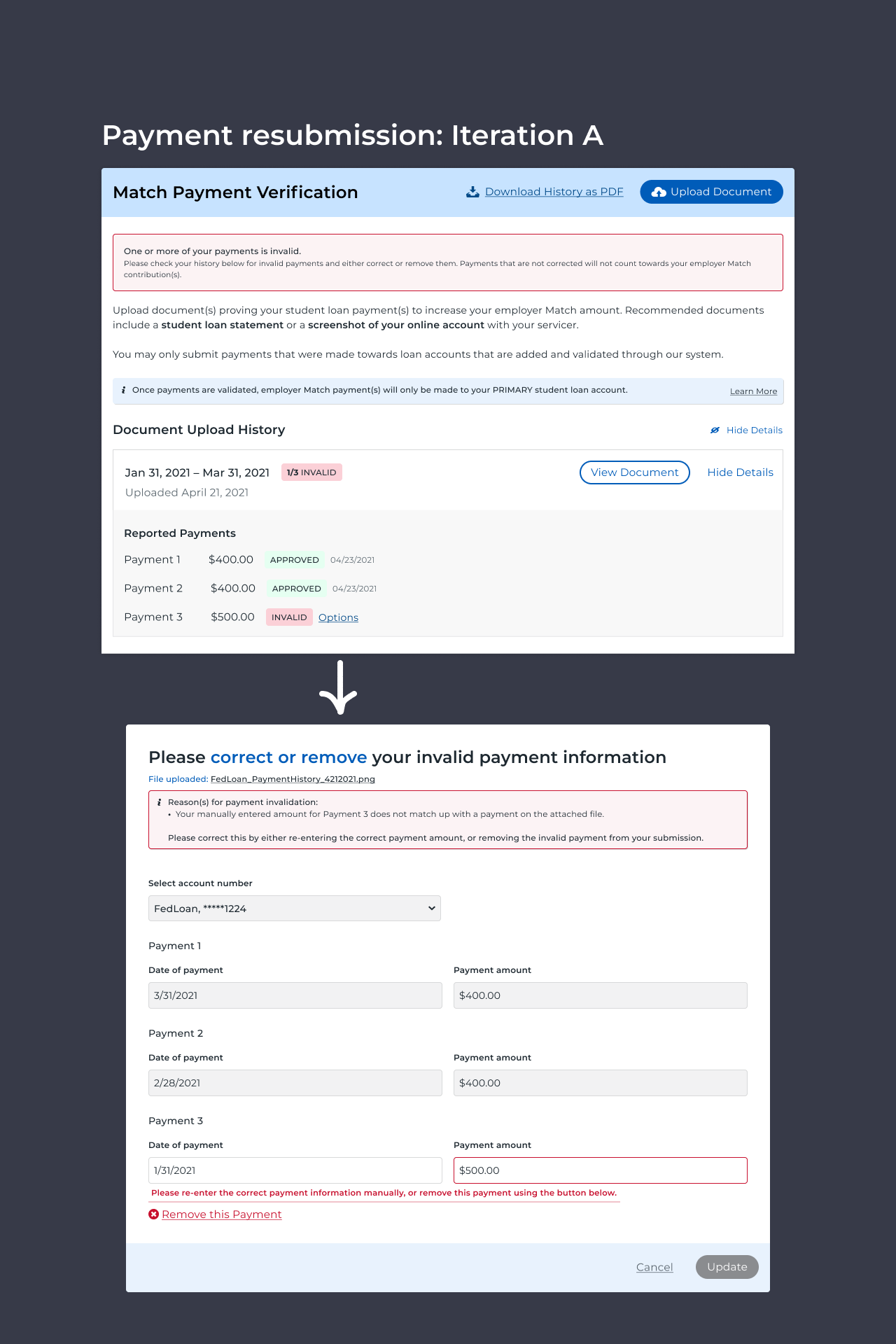
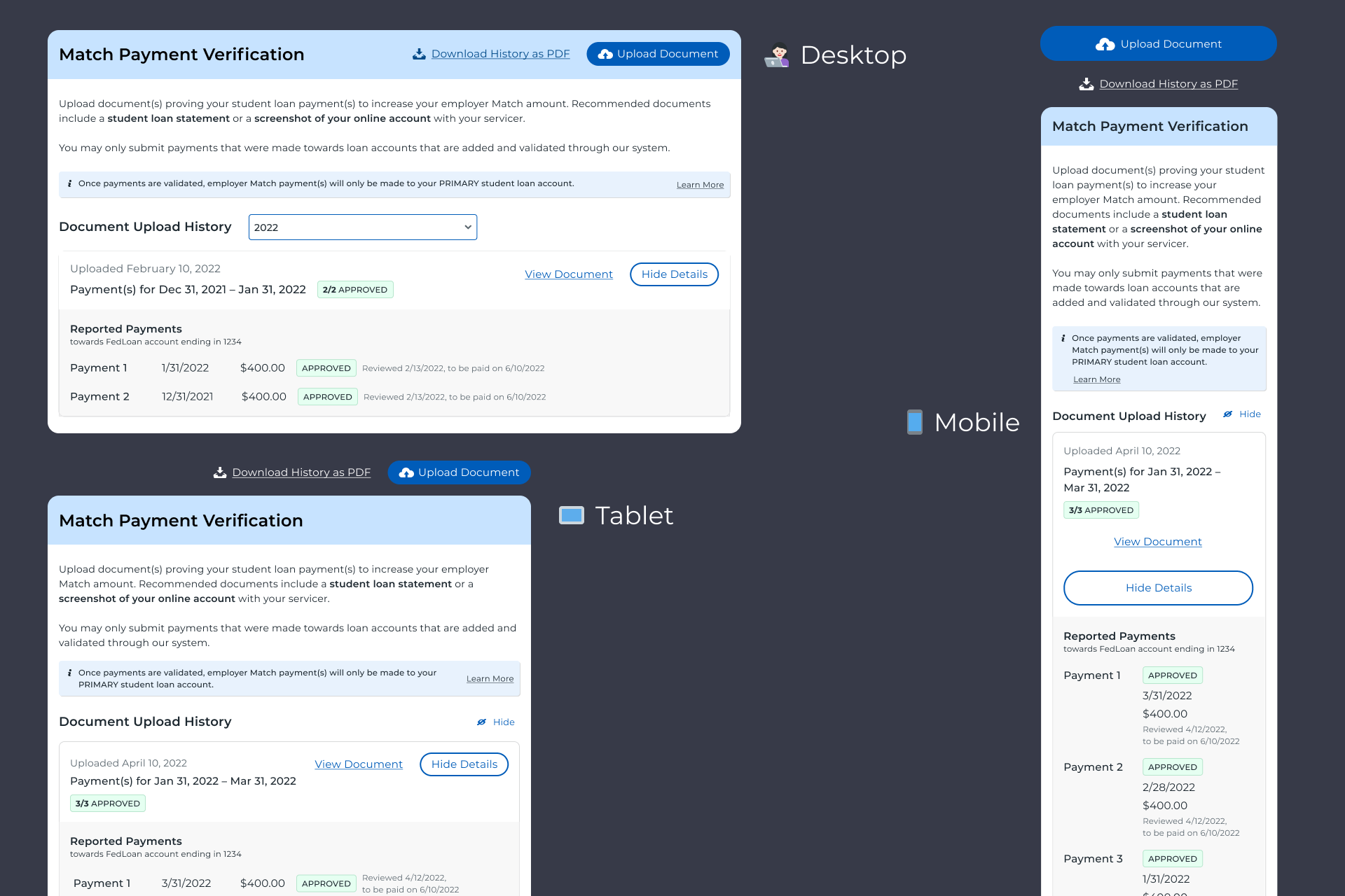
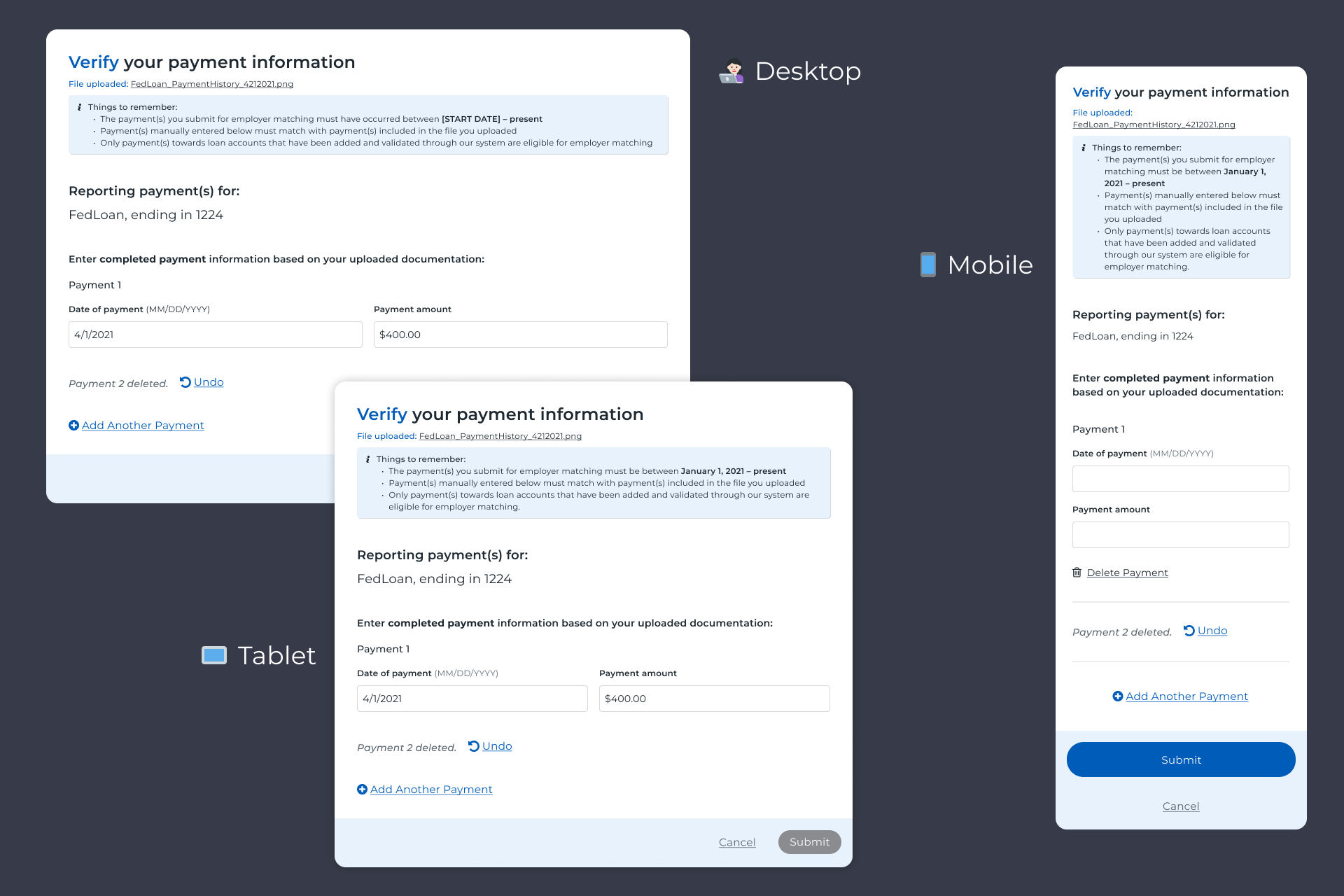
I participated in some final rounds of UX designer peer review and finalized desktop, tablet, and mobile designs. At this point, my main focus was prepping the final designs for developer handoff. I broke my designs down into Jira-ticket-sized-chunks and labeled them by ticket number, adding contextual information, explanations, and specs wherever needed. I had been designing for tablet and mobile breakpoints at the same time as the desktop designs, but I made sure to fill in any gaps and to clearly call out any differences between desktop vs. smaller screen sizes, whether it be larger differences in component structure or “micro” differences in animation style. File paths to the CSS were already attached to pre-existing components via the design system; any net new components were marked so the devs knew to add them to the codebase.
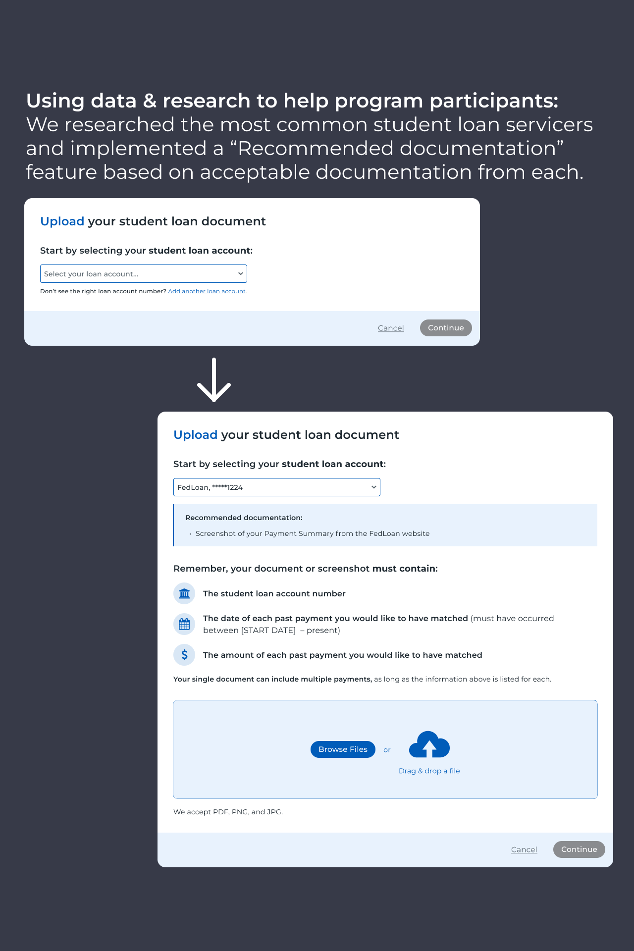
We were able to launch the MVP on schedule, and the client was extremely pleased with the launch. Even with a tight timeframe, we were still able to include features that differentiated us from existing platforms, such as the ability for participants to edit and resubmit information at both the payment and document level; clear feedback and next steps for every user state the participant may encounter; auto-populated "recommended documentation" messaging based on the loan servicer selected; optimized animations with screen size in mind; the ability to undo when a user makes a mistake; and much more!
07.-
Research
Usability testing, round 2
After the successful launch of MVP, I ran an additional round of evaluative usability testing focused on the higher-complexity, quarterly payout structure the client had requested for January of 2022 (vs. the end-of-year lump sum payout structure for the 2021 program). For this round of research, I utilized UserTesting.com to run unmoderated usability sessions with 50 full-time working Americans that currently had student loans. Because of the relatively large sample size, I mainly used quantitative analysis of task completion times, error rates, and Likert scale questions to evaluate how usable the quarterly program’s interface was.
This round of testing allowed us to really hone in on where the areas of confusion would be for the quarterly student loan contribution matching program and identify specific solutions, all the way down to wording updates. The main outputs of this study were: [1] The addition of a notification center as being a SIGNIFICANT improvement in user understanding and successful participation in the program, and [2] The identification of a few key places where added copy and visuals could really clarify the participant experience.
08.-
Impact
Impact & conclusion
The launch of this new program type and its user-friendly experience has already proven to be a great boon for both the business and the program participants. Managing stakeholders on our team even described the project internally as the "largest, most well-tested release we've ever done"! We had a total of 6,234 program participants in 2021 and disbursed a total of $9.8 million in employer matching contributions to employees’ student loans. In 2022, those projections were up to $16.7 million in matching contributions. As I mentioned before, the client described the launch as “flawlessly executed”, and it has led to a happy and healthy continuing partnership. Additionally, the notification center feature was launched this year and has provided us an extremely effective way to send proof-of-payment submission reminders and general announcements and updates to users of all of our program configurations!