
UI Design, UX Design, UX Research
Theater night
Role
Co-Lead UX Designer, UI Specialist
Start
Jul 2021
Handoff
Sep 2021
Product
Theater-focused ticketing platform (patron side)
00.-
Introduction
By the end of this case study, you'll see how I:
[1] Collaborated with another talented UX Designer to test, improve, expand on, and create the final UI for her original lower-fidelity designs; and
[2] Successfully handed off well-documented screens for a mobile-first patron ticket-buying platform, to the client’s enthusiastic approval!
2
UX Designers on the project
49
hours of work
63
desktop screen designs
127
mobile screen designs
01.-
Challenge
Project background & challenge
I was brought onto the project as a part-time contractor to help a talented, fellow UX Designer complete the rest of the design process for the entire patron-side event ticketing experience of the product (if you'd like a sneak peek of this work out in the wild today, check out the company's feature webpage). There were a couple of main challenges that the designer was facing when I joined.
Most existing ticketing platforms are optimized for desktop. Even "big name" ticket-purchasing platforms still often fail to balance all of the visual, textual and interactive components needed during the ticketing flow on mobile screen sizes. As a result, the designer had committed to a mobile-first approach. (At first, this was a bit of a challenge; however, you’ll see by the end of this report why I ended up loving this approach and how it made it much more efficient to create designs for additional device sizes.)
Additionally, she was running into a designer's block after her first iteration of mobile screens for the main flow (what many UX Designers call the “happy path”). The largest issue she was having was related to thinking through and building out the designs for unhappy paths and edge cases, as well as employing a modern and consistent visual design approach.
After jumping in and immediately getting up-to-speed on some of the feedback from a previous round of user interviews, it was clear that the main flow needed to be reworked to allow for a more flexible and intuitive ticket selection and purchase experience. The UI and many of the page layouts also needed to be updated across the board so that the look and feel was sleek and modern while remaining consistent. Finally, the designs needed an accessibility evaluation so corrections could be made and the software would be compliant and accessible to all.
You can view a preview of the final designs below – Scroll on to see how we got there.
02.-
Iteration
UX Design iteration, round 2
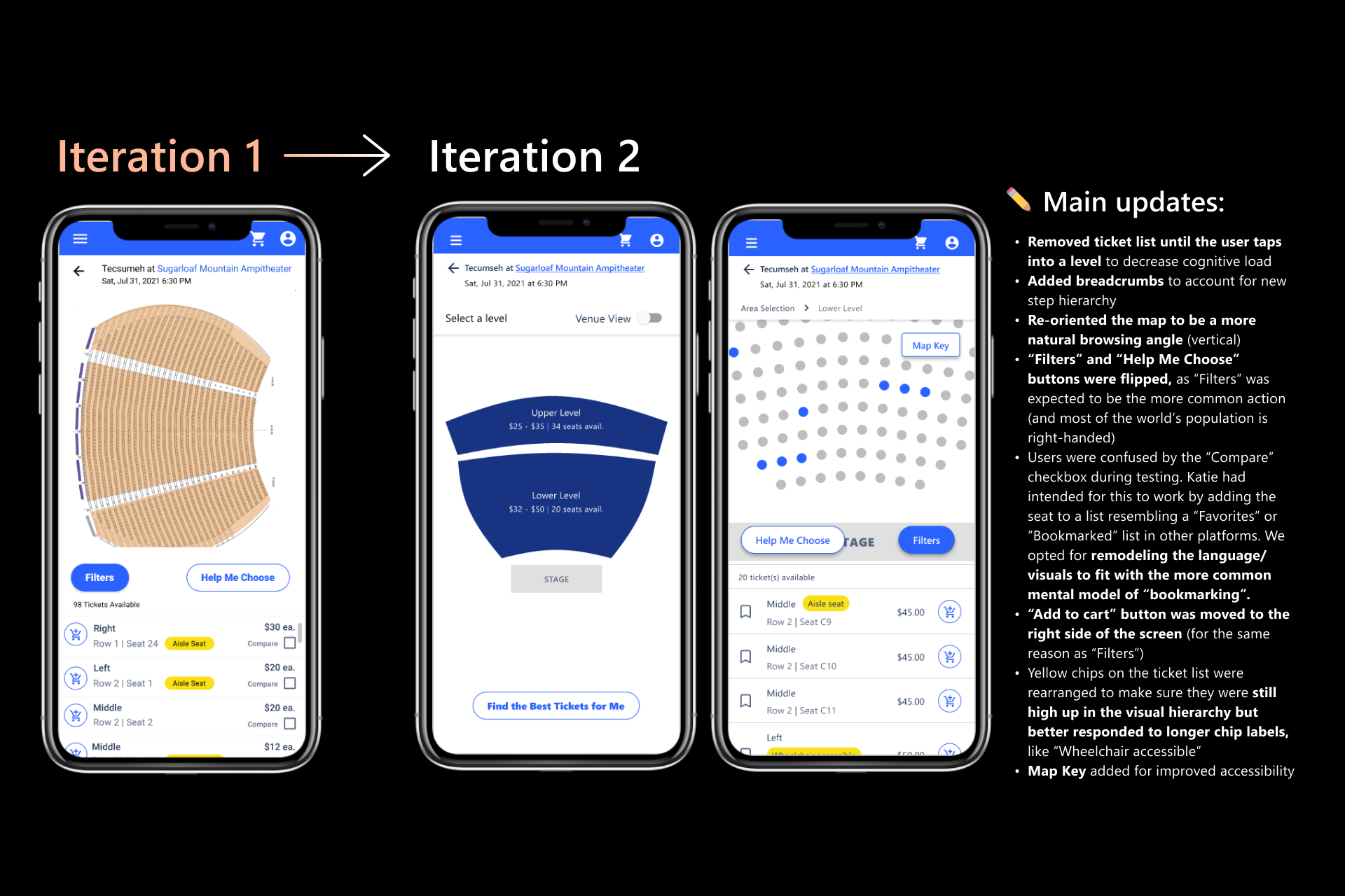
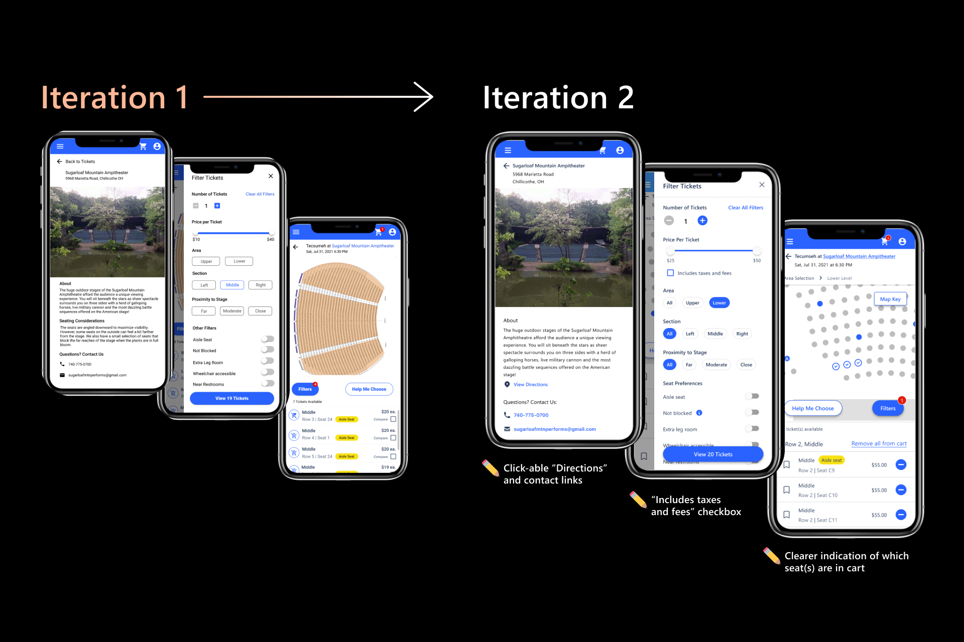
When I was brought on, the co-designer had already finished the lower-fidelity prototyping phases of the UX Design process, and had also completed an initial round of moderated usability sessions using an initial high fidelity prototype iteration. I worked with her and the PM to thematically analyze their qualitative notes and recordings from this first round of testing. The co-designer and I used the outputs of this analysis along with our own round of heuristic analysis to then collaboratively brainstorm improvements for the designs.
We chose to use the diverge-converge design methodology (also referred to in some contexts as the double diamond methodology). Katie and I diverged to create further design iterations, then converged after about a week to go through our ideas together and finalize a second-round high fidelity prototype for testing. After convergence, I took the lead on making sure the UI of the UX was high fidelity and consistently styled throughout. Thankfully, we were using a custom version of the Material UI component library for the project that had already been converted to a design system on Figma, so I was able to speed up the UI updating process that way and create most new components by basing them off of existing ones.
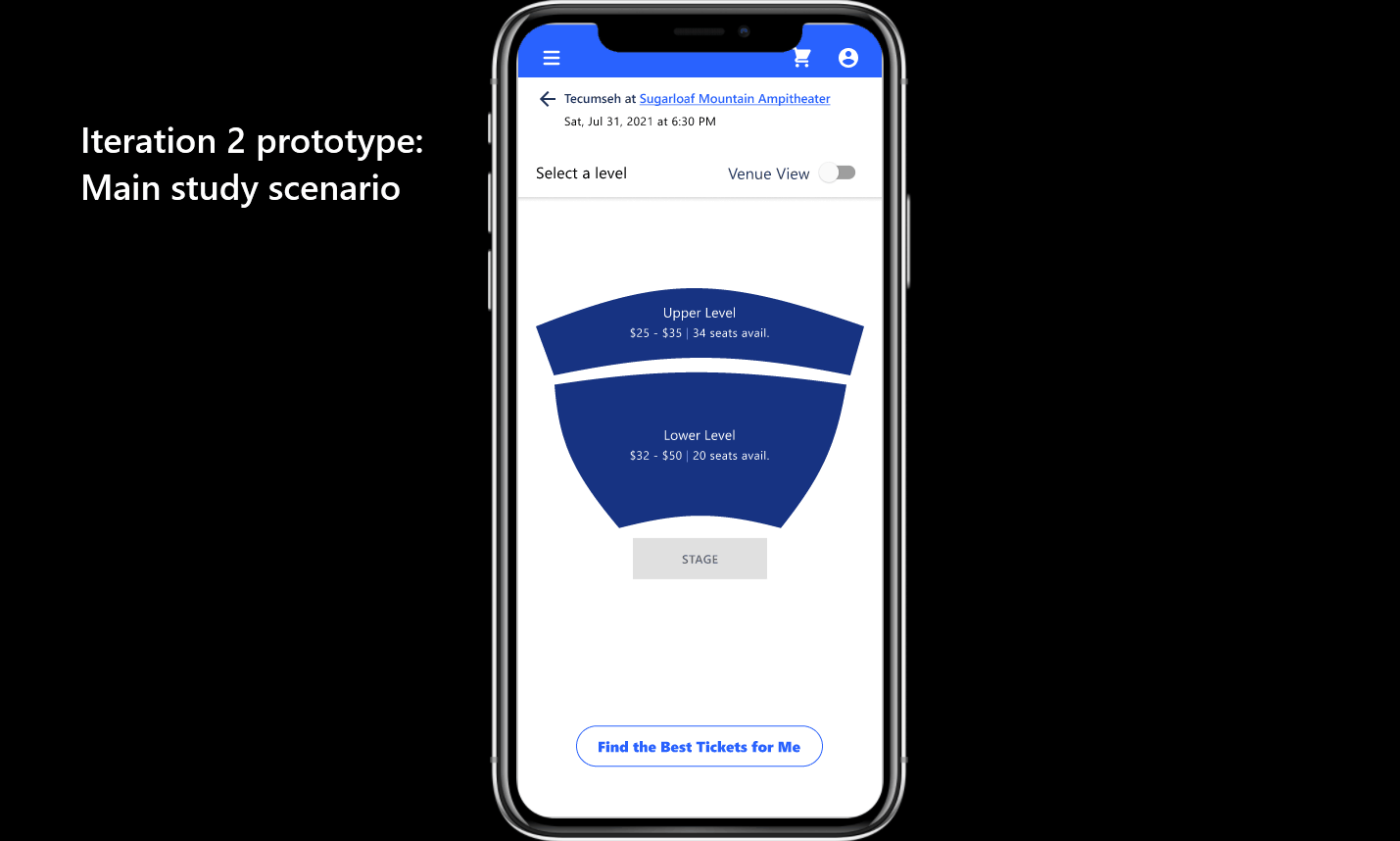
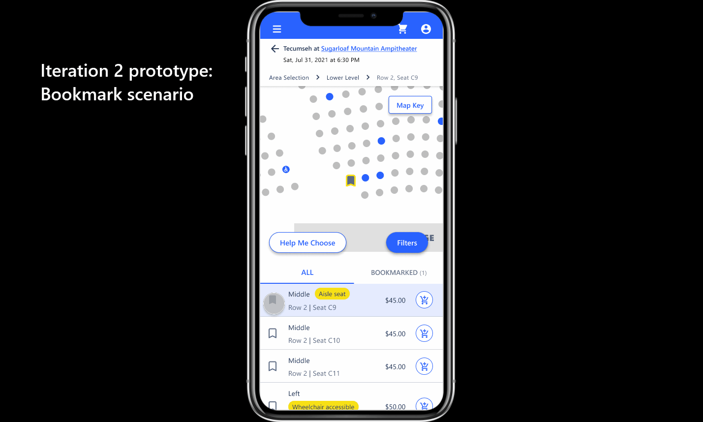
You can find some before-vs.-after examples below of the original designer's round 1 iterations vs. our collaborative round 2 iterations.
03.-
Research
UX Research, round 2
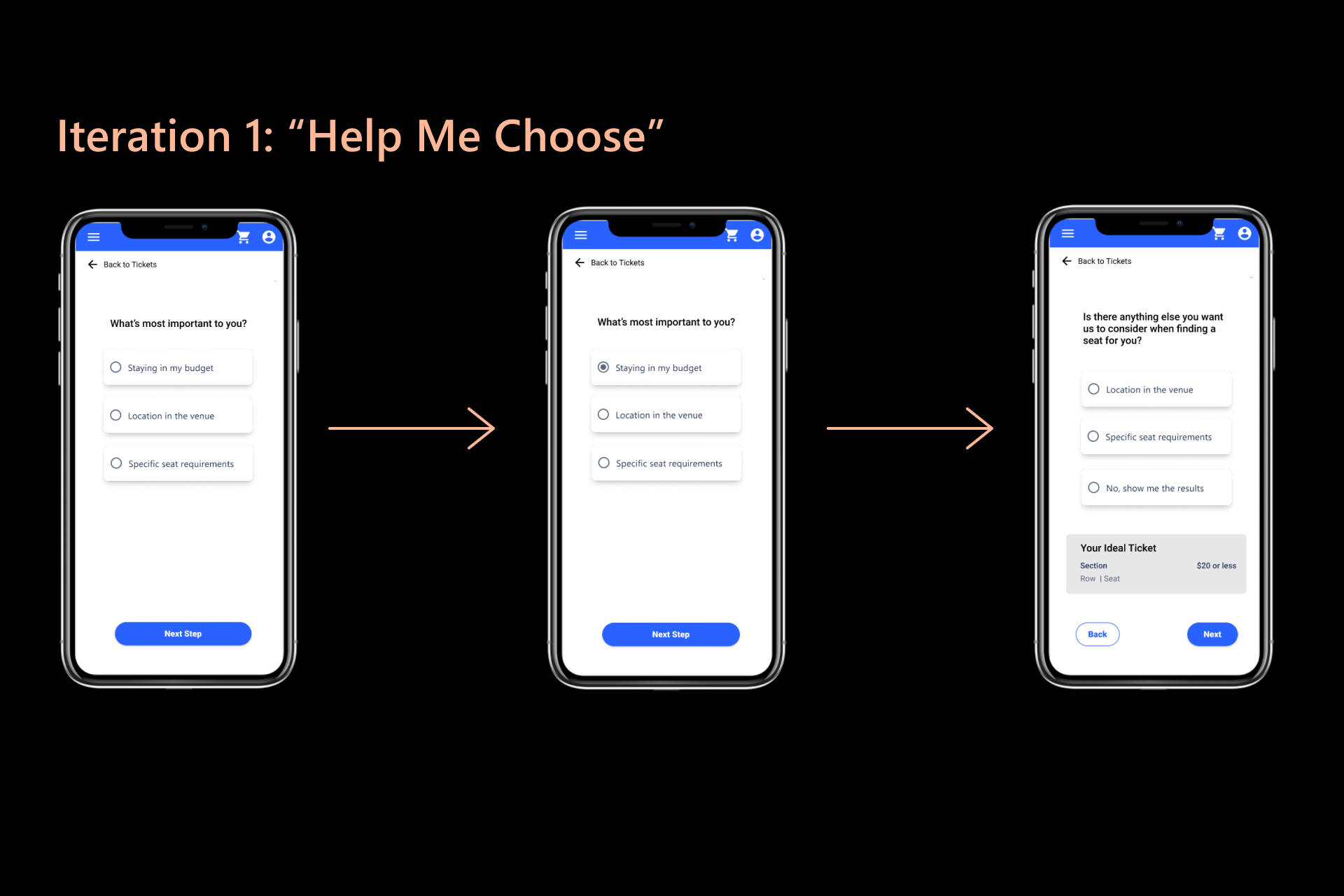
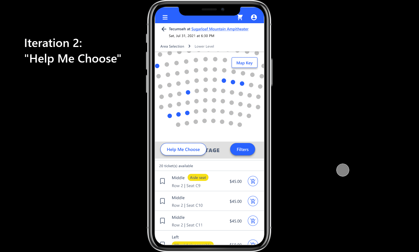
Next, we ran a second round of usability testing — this time with the Iteration 2 prototype. This UX research phase was evaluative in nature; we primarily wanted to validate that our updates truly led to a better experience, as well as catch any last usability issues that may have been missed in the prior round. Additionally, we had built out a more robust, end-to-end flow for Iteration 2 that included features the co-designer had not finished for the first round of testing, including the full “Help Me Choose” flow and a built-out “Bookmarking” feature (previously the “Compare” checkbox).
The co-designer and I collaborated on the construction of the UX research plan. I took charge in terms of constructing the Iteration 2 prototype, as we wanted to make it hyper-realistic and I was well-versed with constructing these types of prototypes within Figma. With such a limited amount of time left (about one month) until design handoff, we stuck to the industry-standard usability test sample minimum for catching usability issues and aimed for a total of 5 participants for the study. Due to the time constraints, the COVID-19 pandemic being in full swing at this time, and the PM’s hope to recruit existing product users only (rather than look-alikes), we ended up with a sample of 4 study participants. Katie and I split the moderation of the sessions between us, and we focused mainly on collecting and analyzing rich qualitative data from think-aloud comments and question responses.
04.-
Iteration
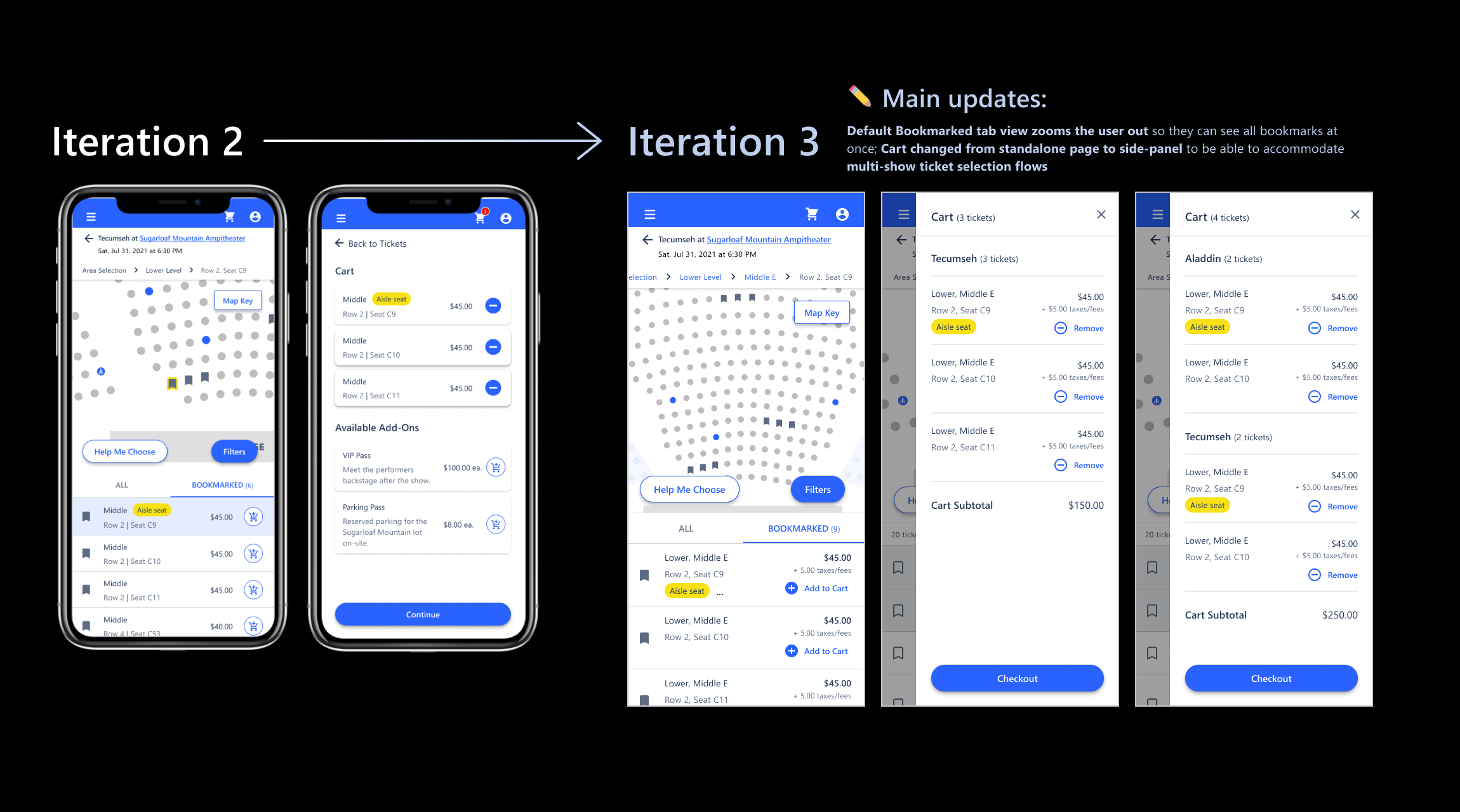
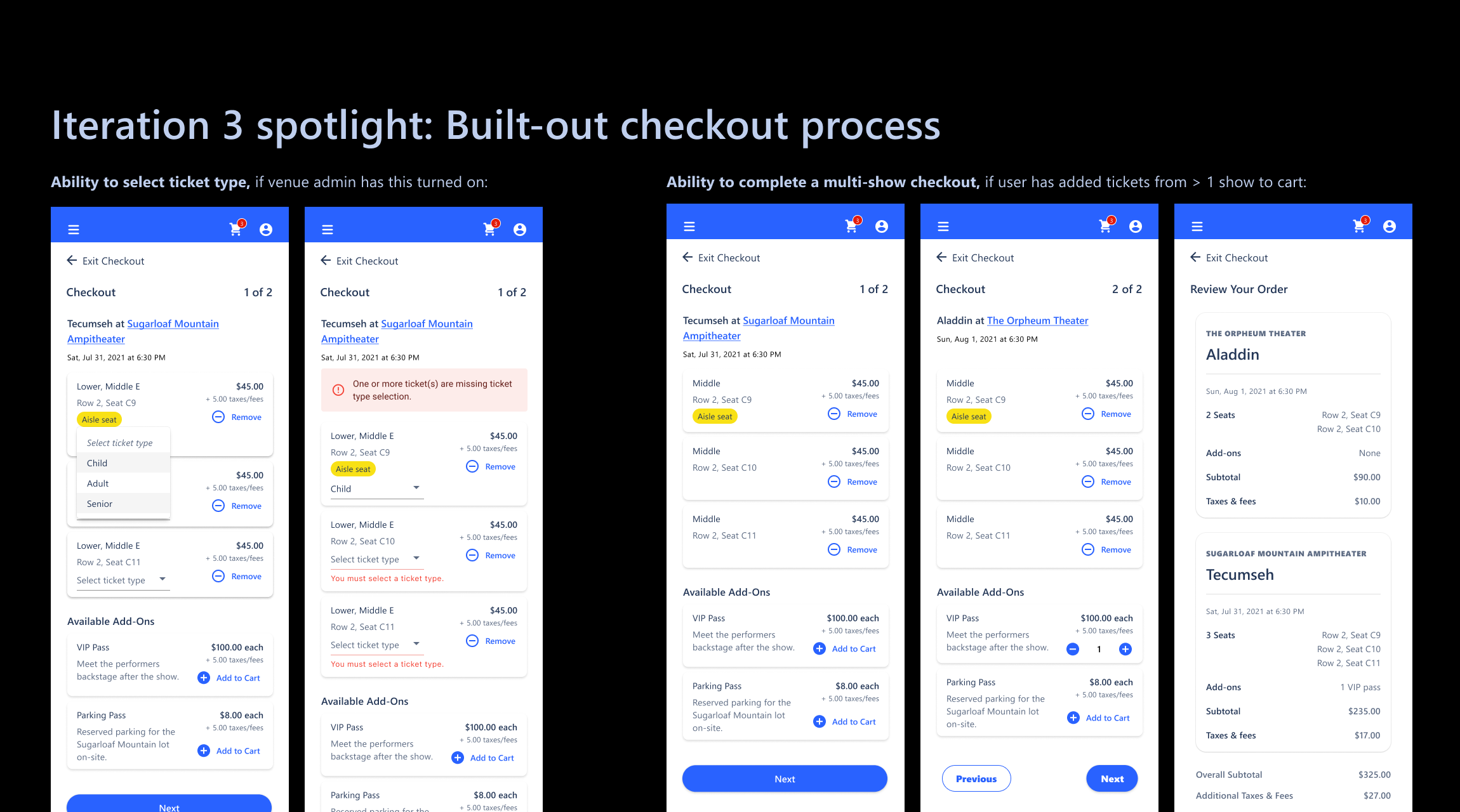
Design iteration, round 3
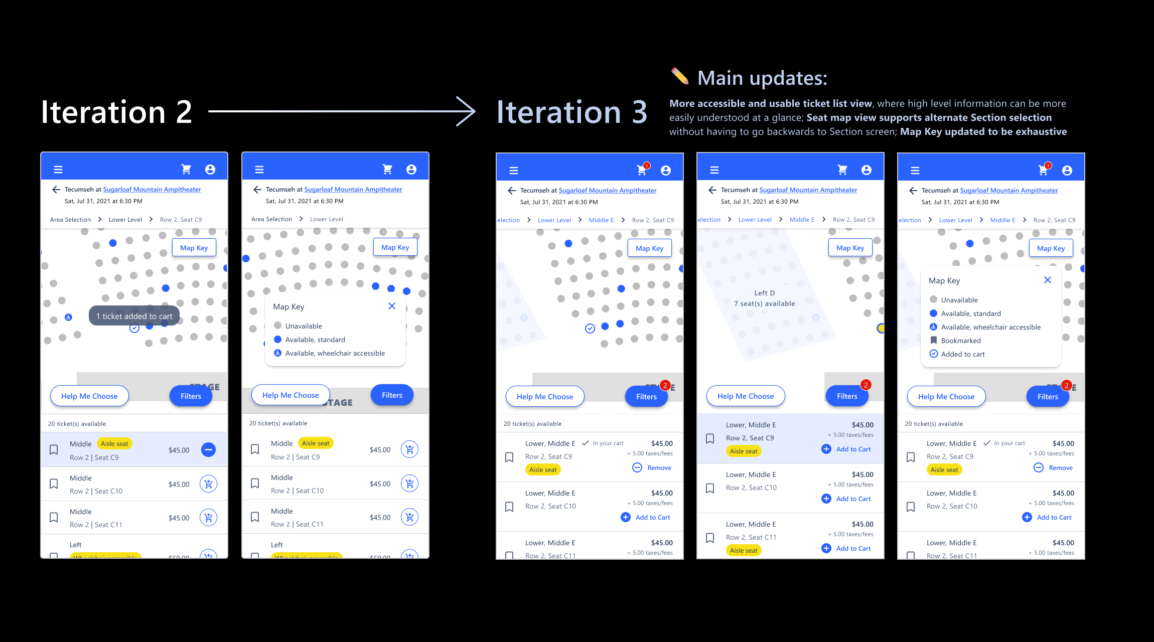
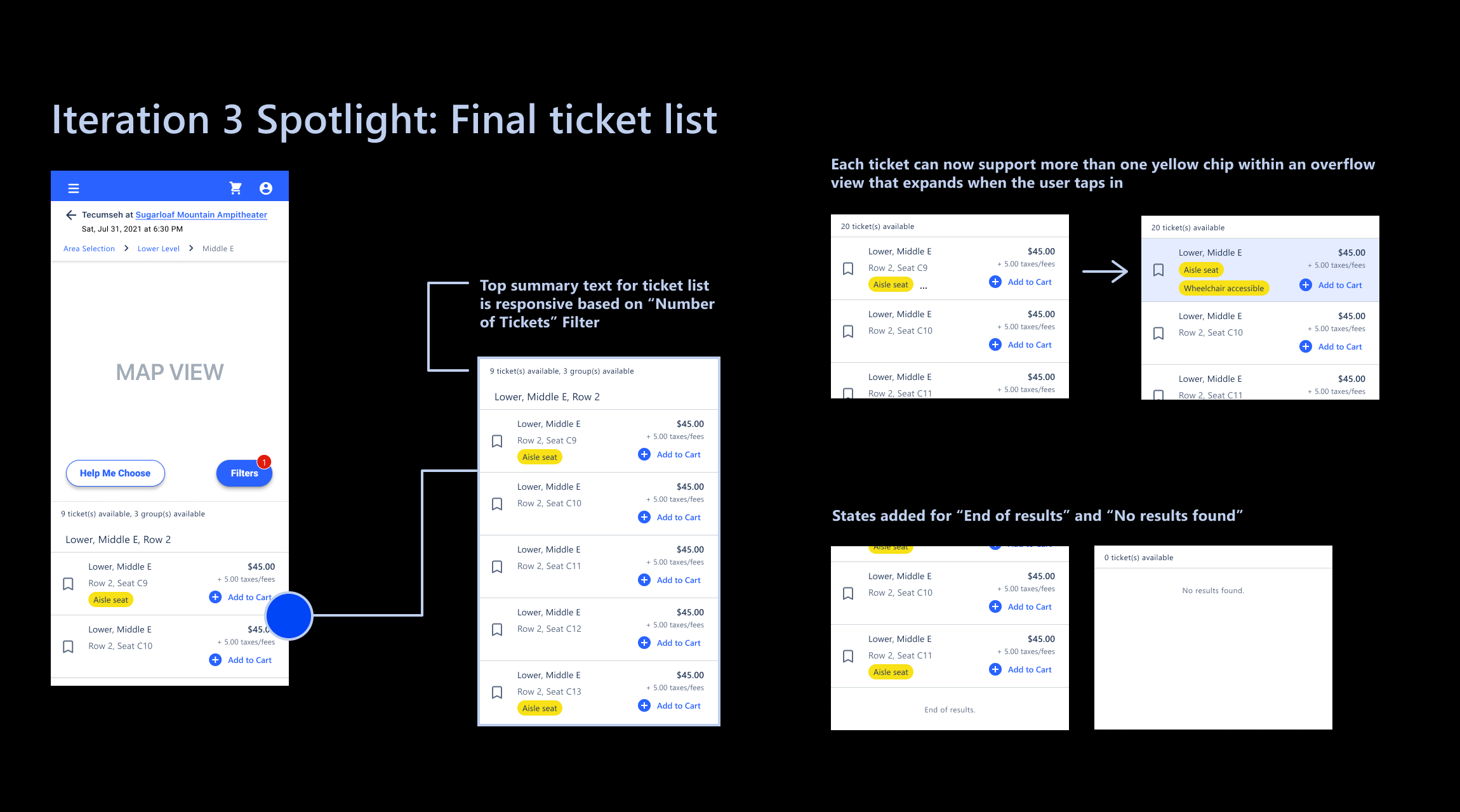
We were able to glean a number of actionable insights from the results of this UX research phase, combined with those of the previous phase. Most notably, we found that the ticket list component needed further improvements to layout, clarity, and accessibility, as users were still becoming confused about which seat(s) were in their cart already vs. not; themes from testing helped us finalize the look and feel of this feature, and the final updates can be seen broken down in the second image below.
Additionally, we looked beyond the smaller tweaks from the study results and began collaboratively brainstorming around every alternate user path, other than the happy path, that we had not yet designed for. We found during brainstorming that we had not covered the scenario of a user purchasing tickets to multiple different shows during the same platform visit, so we made sure to design for this use case. We also identified and designed for any remaining error and empty states.
We ran Iteration 3 by the PM, and continued on to preparing the Figma design file for dev handoff after his enthusiastic approval.
05.-
Stakeholder handoff
Closing design work & dev handoff
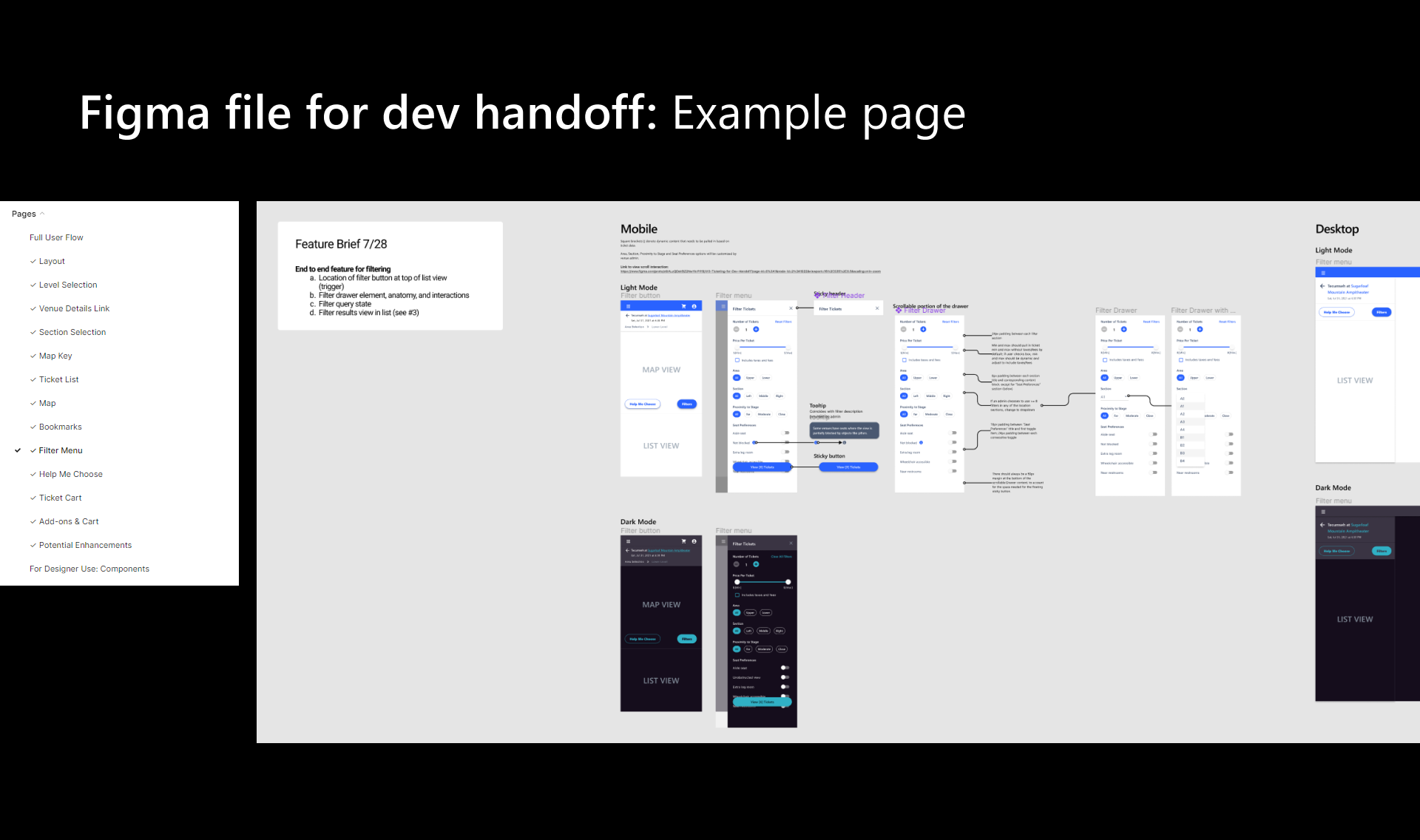
Finally, it was time to prepare the designs for developer handoff! The co-designer and I collaborated on a handoff file format we were both familiar with, where we split the Figma file into pages using a system similar to the way agile developers break work up into “stories”. We named each page based on the story/component it contained; then, we clearly laid out the finalized mobile screens. In addition to the light mode mobile screens we had already completed, the co-designer and I split up the remaining work, which involved translating each mobile screen to desktop form and covering dark mode versions for both screen sizes. We added notes on specs and clearly annotated which screen aligned with which user flow/state for the devs as well.
Throughout the finalization of the dev handoff file, we met with the PM and developers on the project to review our progress, receive signoff on desktop versions, and ensure that all design solutions were feasible for implementation. This was the first time I had the privilege of working on an experience that was mobile-first, and as you can see from some of the mobile-to-desktop carousel slides below, using a mobile-first approach made it infinitely easier and more efficient to then create desktop versions. We were able to hand off the final Figma design file on time during the first week of September, 2021!
06.-
Impact
Impact & conclusion
Through the co-designer and my collaborative efforts on this project, we were able to hand off a whopping total of 127 finished mobile screens and 63 desktop screens to stakeholders on time, and to their complete satisfaction! The screens included both light and dark mode versions, happy paths, error states, empty states, and alternative user journeys. Despite the client being on the smaller side in terms of total business size, we were able to utilize thorough qualitative UX research and our own expertise to bypass many of the user frustrations associated with bigger-name ticket-purchasing platforms on mobile, and we were even able to include some novel solutions that we had not seen done before in our intiial competitive research survey, like the "Help Me Choose" flow. The client was so pleased with our work that he asked us to work on a new project for him on the admin side of the platform, which was still in the requirements gathering stage - but that's a story for another day.