
UX Design, UI Design, UX Research
CarFlix
Role
UX Designer
Start
Aug 2020
End
Dec 2020
Degree
M.S. in Human-Computer Interaction
00.-
Introduction
By the end of this case study, you’ll see how three other talented UX professionals and I utilized the rapid contextual design process to design a novel mobile application for managing and enhancing visits to drive-in venues.
4
months to complete
4
HCI M.S. students on the project
8
main process steps (+ a bonus research step)
83
hi-fi mobile screens delivered
01.-
Challenge
Project background & challenge
Drive-in movie theaters have steadily shut down over the years, with only about 325 still operating in the U.S. today (compared to about 4,000 during the 1950’s). The demise of drive-ins has been attributed to a number of factors, including the industrialization of the U.S., “development of television, indoor multiplexes, the changing nature of the industry’s cost and revenue structure, and location decisions” (Fox & Black, 2010). However, at the time of this project (late 2020) I noticed they were experiencing a bump in popularity in the New England area due to the physical distancing requirements that came along with the COVID-19 pandemic. I made a trip out to one myself and thoroughly enjoyed myself — paying a fraction of what I normally would because the ticket was per-car, taking in the night sky above, cuddling up with huge blankets in the trunk, pigging out on the endless snacks we brought, petting dogs on the way to the restroom, and watching a new-release movie on the big screen. My group and I agreed that this was an experience that could be worth protecting, and could potentially grow back into a thriving industry. But what could a handful of UX professionals do about it?
By the end of our project, it turns out we were able to do quite a bit. A major downfall of drive-in entertainment venues were their antiquated processes and lack of updated technologies, and through the use of the rapid contextual design process (Holtzblatt, Wendell, & Wood, 2005) we were able to develop thorough solutions to these issues in the form of a mobile app concept and high fidelity prototype.
02.-
Contextual inquiry
Contextual inquiry (step 1)
Our two-week contextual inquiry process resulted in an assortment of products, artifacts and documents that were shared among team members. These assets aided us in creating user groups, developing interview questions and generally gaining more knowledge about the physical drive-in space itself.
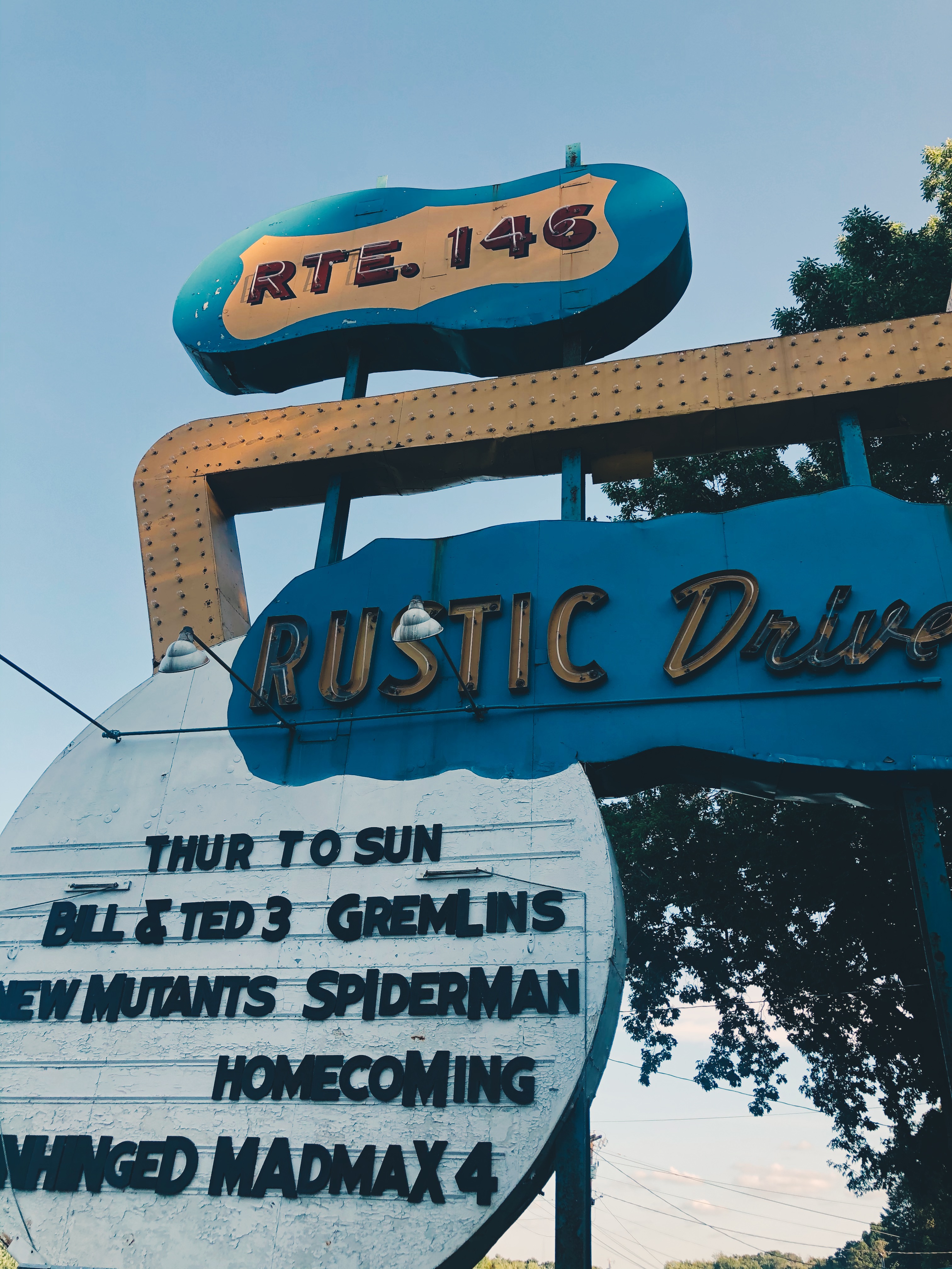
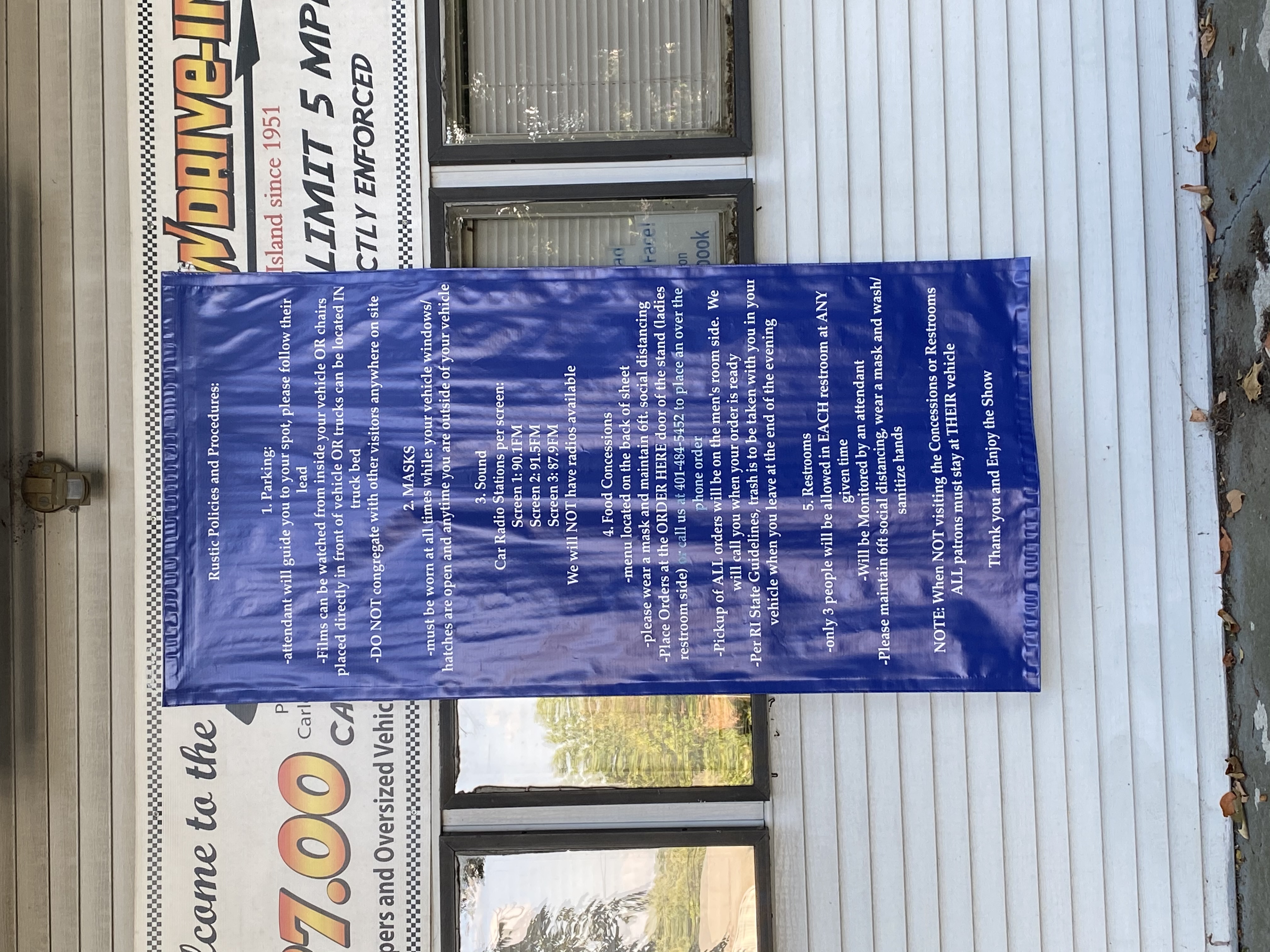
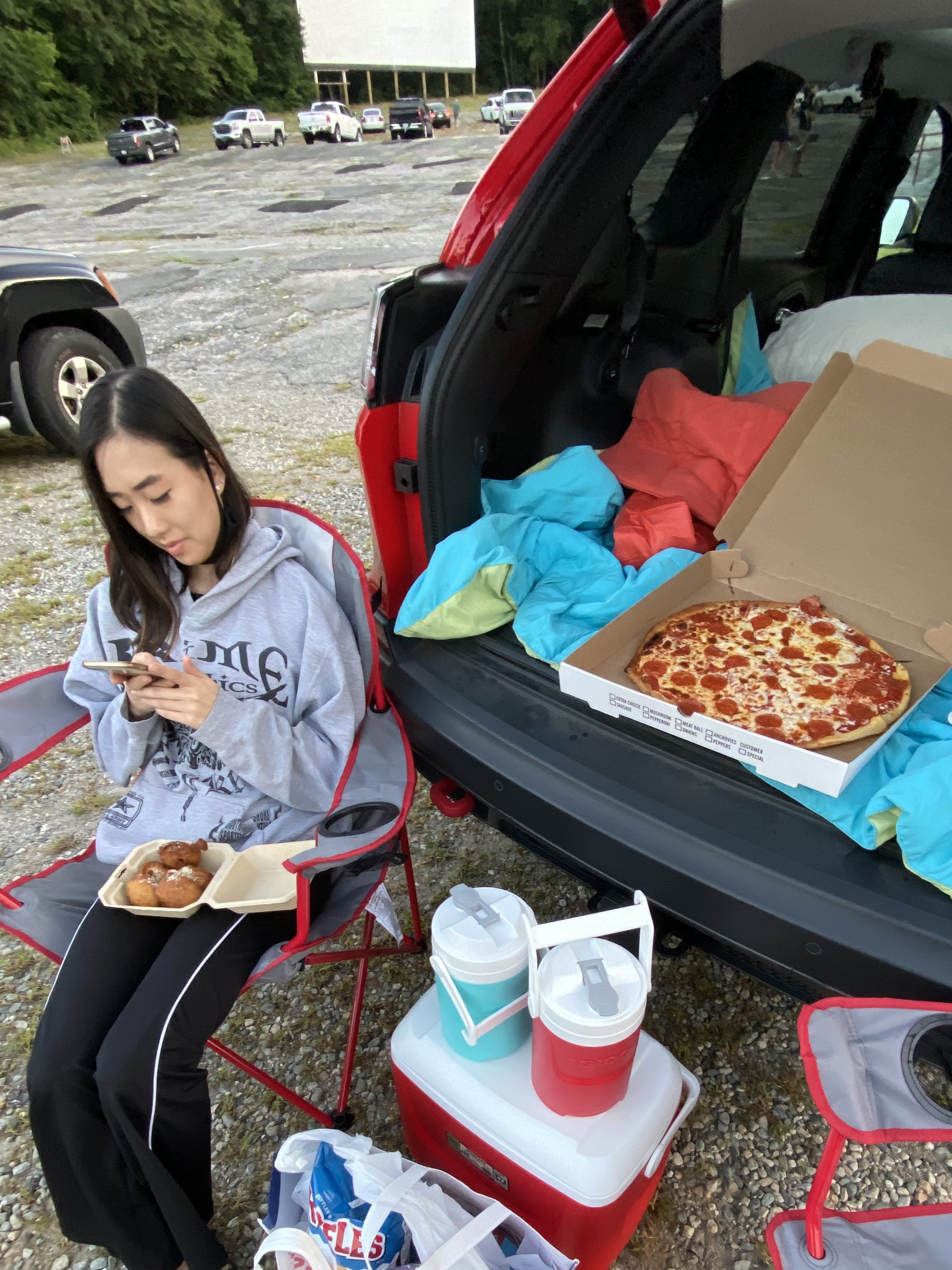
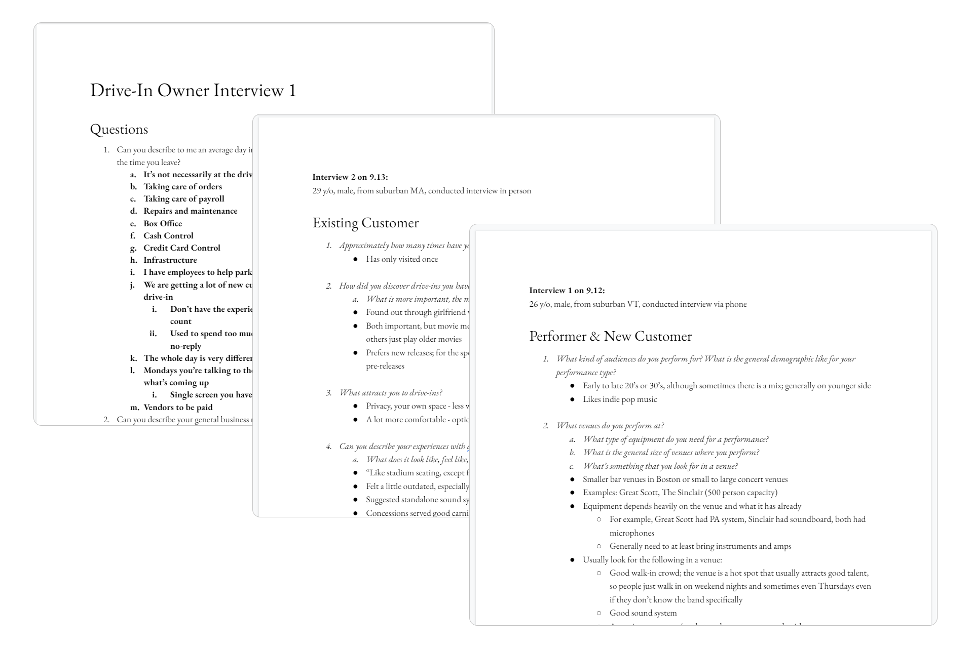
[1] First-person research (an actual visit to the context of use) — Preliminary research involved a member of the team attempting to find drive-in theaters near them to visit in person. The team member resided in Massachusetts and first used a "drive-in theaters near me" Google search to locate the nearest drive-in; however, the filtering options were sparse, and much of the legwork had to be done individually. Once there, the team member took detailed notes on the features and shortcomings of their experience at the venue. See the first set of images below for documentation of an in-person visit to the Rustic Tri-View Drive-in in North Smithfield, Rhode Island. The team additionally did a round of competitor research, where we found just a handful of existing mobile apps related to drive-ins. They all had antiquated interfaces, limited functionality, and were tailored to only one specific drive-in (rather than serving as a marketplace for all drive-ins, as we were hoping to do).
[2] Interviews with key user groups — The first step to collecting interview data was determining who we needed to interview. We referred to our original project plan where we identified our customers and stakeholders. Regardless of what features and solutions ended up in our product, we needed to form a better understanding of the overall subject matter, environment, and holistic needs of these various user groups. We decided it was important to include 4 main user groups in our contextual inquiry so that we were framing the bigger picture, and to more accurately capture the features that would drive the refined scope and target group for our prototype: [1] Owners; [2] Existing users; [3] Performers; and [4] New users.
- Preparation: We prepared for interviews by creating a set of template questions for each user group. These templates were tailored for semi-structured interviews and consisted of roughly 10 questions each with different sub-questions to help guide the interviewer during the session to spark natural conversation. Each template explored the day-to-day activities, environment, needs, wants, and experiences that were unique to that group. We also compiled an introduction that could be used by the interviewer, as well as a general set of demographic questions that would be used for all interview types.
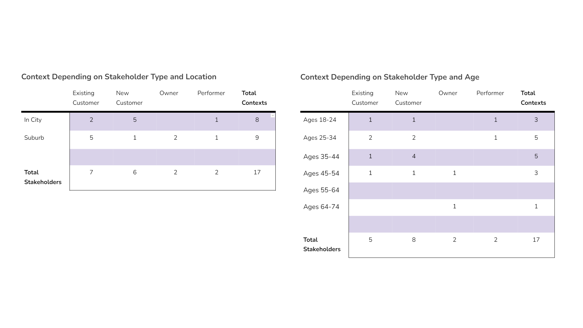
- Conducting the interviews: Although all interviews during the contextual inquiry process would ideally occur within the context of use, the COVID-19 pandemic prevented us from meeting with most of the interview participants face-to-face. However, we were able to complete the interviews through phone calls, video conferences, and some in-person sessions. We ended up with interviews from 2 Owners, 7 Existing Users, 2 Performers, and 6 New Users for a collective total of 17 interviews.
03.-
Affinity mapping
Interpretation & affinity mapping (steps 2 & 3)
The group conducted an interpretation to go over the interview results, compile artifacts & products, and turn feedback into affinity notes to support the affinity diagram exercise.
The group then conducted an affinity diagram exercise with approximately 500 affinity notes via a collaborative Figma file (FigJam sadly did not exist yet) to enhance collaboration in a remote working environment. The team executed the process described in Rapid Contextual Design by Holtzblatt, Wendell, and Wood (2005) and the resulting diagram can be seen below.
04.-
Personas
Persona process (steps 4 & 5)
Next, it was time to translate our affinity mapping work into personas for our mobile app. Our persona modeling process closely followed the 8 persona development steps detailed in About Face by Cooper, Reimann, Cronin, and Noessel (2014). While I will only be giving a higher level summary here and will not go through all of the 8 steps in complete detail, you can view a more explicit look at the whole process on our project website.
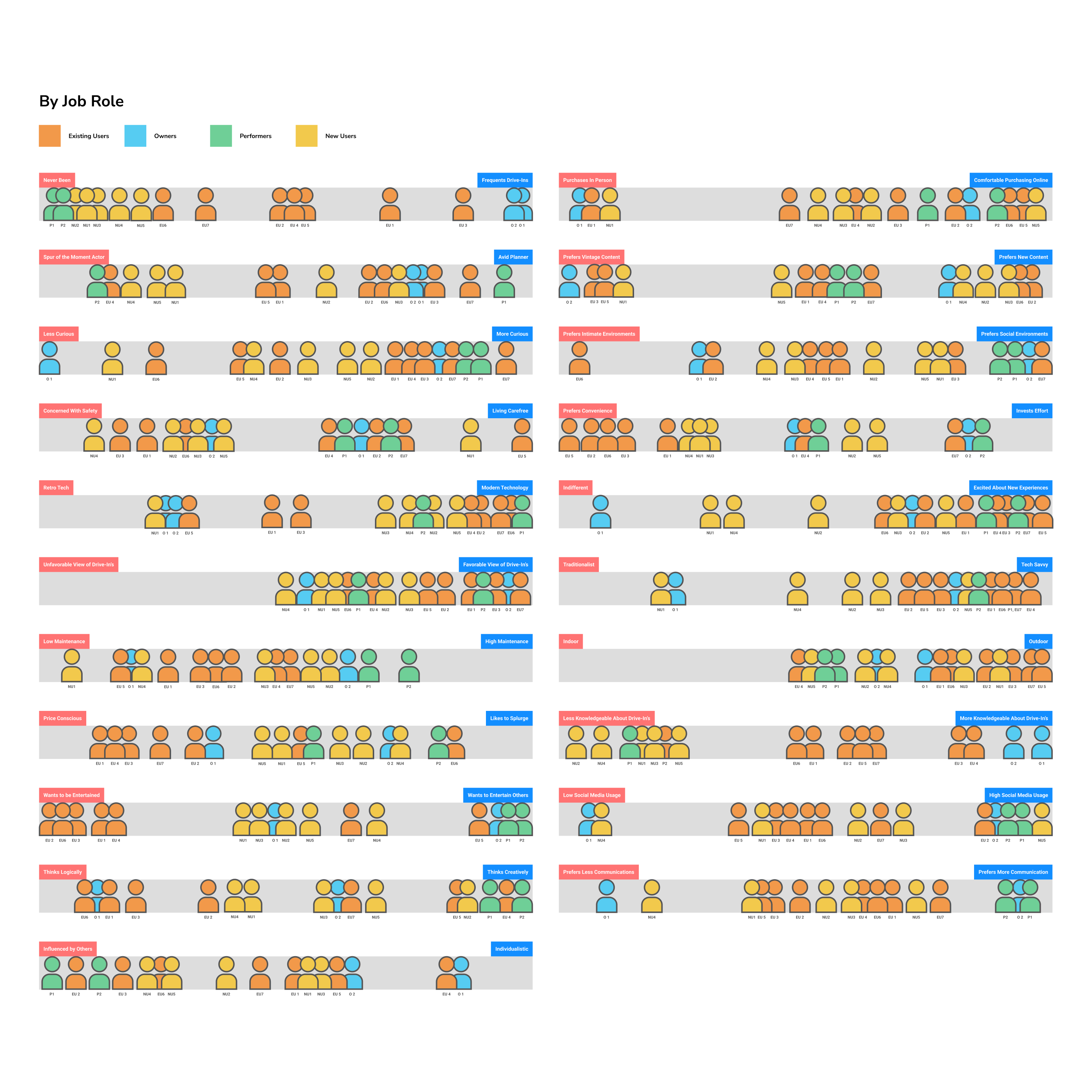
We began by grouping interview subjects by their role (out of the 4 roles defined in the previous section). Each team member then brainstormed a list of distinct behavioral variables for each role. Using the variables, we derived a list of the significant behaviors that would be used to generate scales, which we then used to map the interview subjects against each variable. Next, we created a duplicate board of scales in which we color-coded the users by job role and discussed the board as a group, making adjustments where necessary to more accurately represent relative positions.
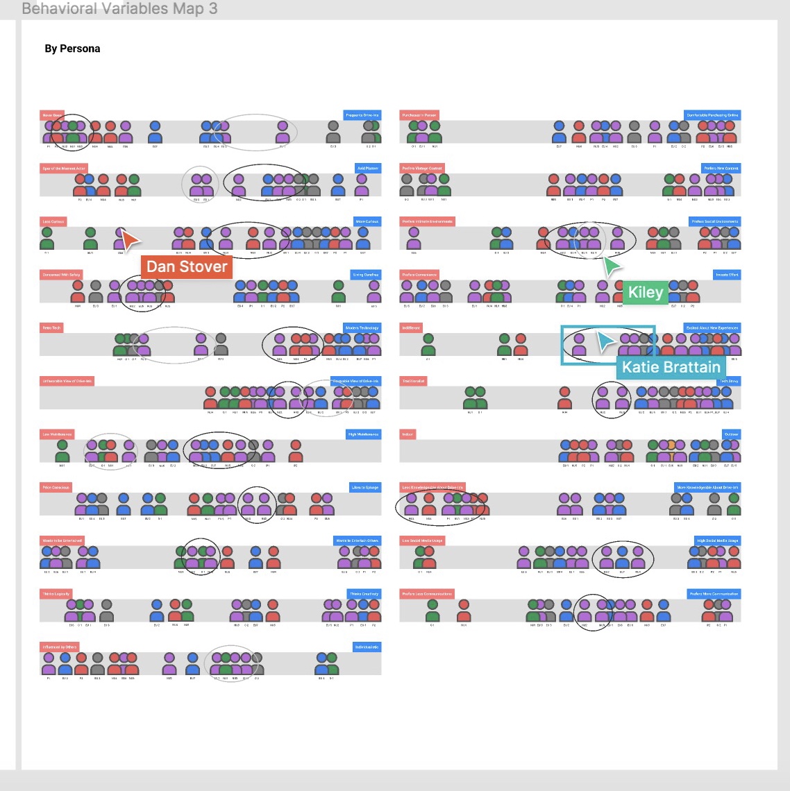
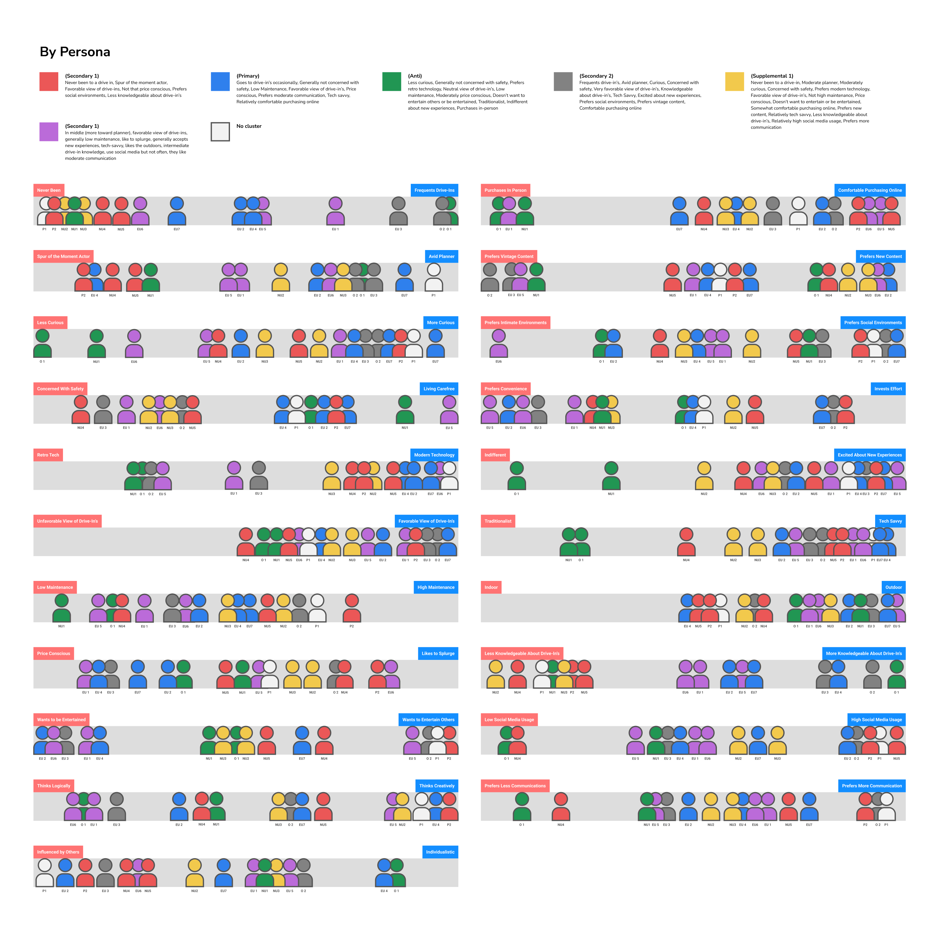
We then began the collaborative clustering process. We used circle shapes to visually represent temporary groupings on each scale of people based on clustering patterns we saw. All of our defined clusters had at least 6 variable scales that they aligned on, with the majority of them exceeding 8. As we started to define clusters, we checked that there was some sort of connection between the users, thinking back to the original interviews we conducted. Once confirmed, we removed the circle groupings and used a new set of colors to help represent the clustered groups on the scale. We ended up with 6 clustering patterns that were used for further persona synthesis.
Finally, we began to shape personas from our research. We defined activities, motivations, pain points, demographics, skills, attitudes, emotions, and their interactions with people and product. We also grabbed direct quotes to help us start framing their narrative and came up with a one-liner catch phrase that captured their essence. We checked for completeness and redundancy and then began designating persona types (primary, secondary, supplementary, and anti). As a group, we identified 5 characteristics that developed a distinct sense of identity for each persona (Tech Savvy, Social Media, Maintenance Level, Online Purchasing, and Familiarity with Drive-ins). These characteristics were also identified as ones that would be important in helping direct our prototype design direction. I’ve included three out of the six total personas we formulated below. It was clear to all of us that the primary persona we would design for was Lindsey; Many of her characteristics and goals were directly related to all of the other personas. By designing for Lindsey, the other personas would at least be acceptably satisfied. The secondary personas had a couple of key characteristics that would not be captured by Lindsey's needs. The remaining personas were deemed supplemental because they were captured by the primary and secondary personas.
05.-
Lofi phase
Lo-fi prototyping (steps 6 & 7)
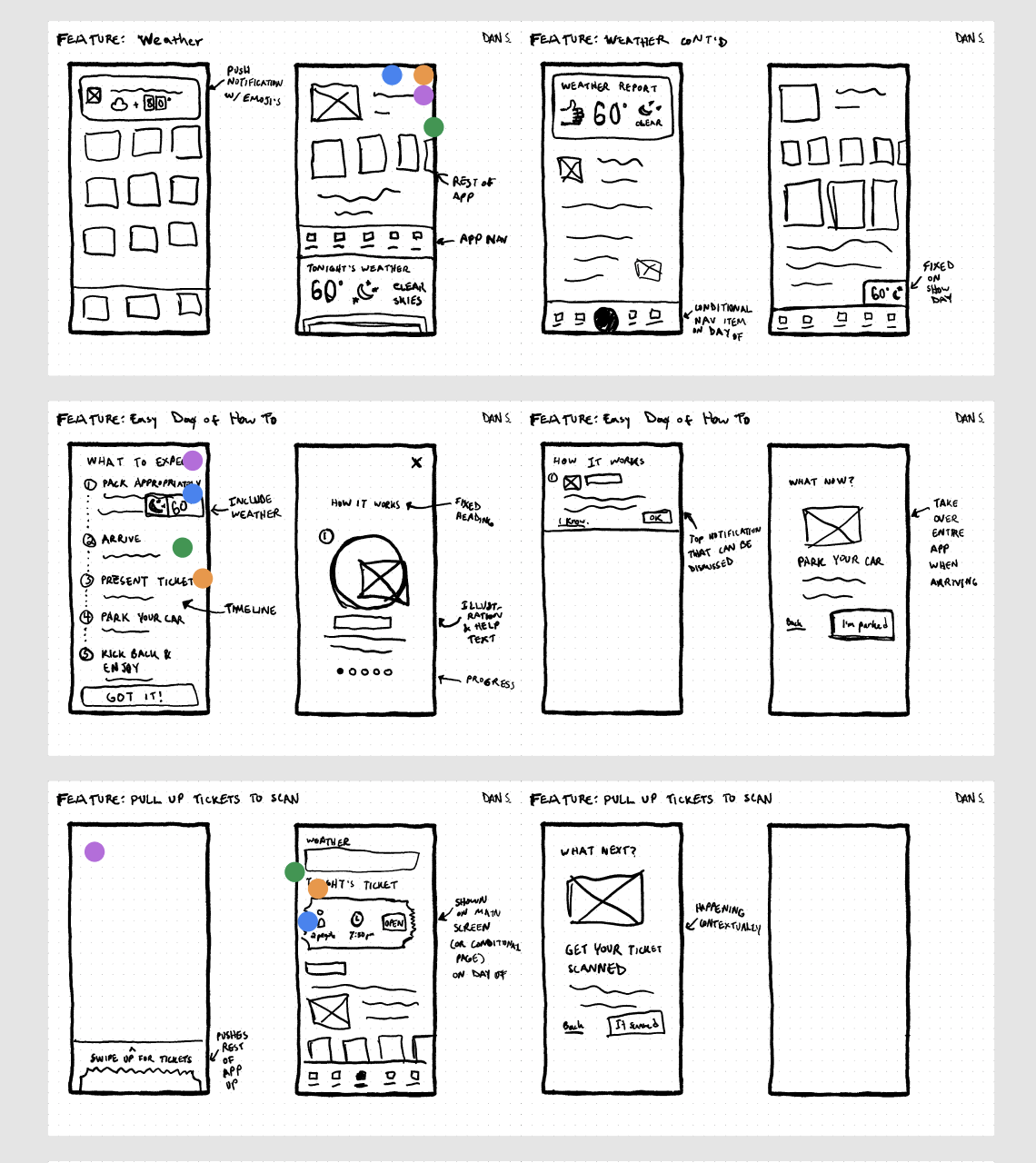
To help build a prototype that satisfied the primary user needs, we brainstormed possible solutions in 5 main areas: Arrival, Audio (during visit experience), Exploration, Ticketing, and Concessions. Each team member came up with ideas for their area and then we reviewed the list together as a group. The lists evolved into large pieces of functionality, some of which were not directly related to our core users or their journey. The top features were selected by the group to move into the paper sketching phase.
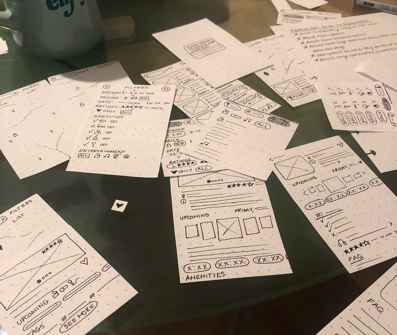
After we came up with possible features, we sketched multiple versions of each feature to rapidly come up with ideas for a final approach. This was helpful for brainstorming and allowed us to visually represent ideas for our app in a simple manner. It also gave us different ways to visualize the same journey so that we could identify any gaps, plan the information for each feature, and create a consistent journey that would align with our users’ needs.
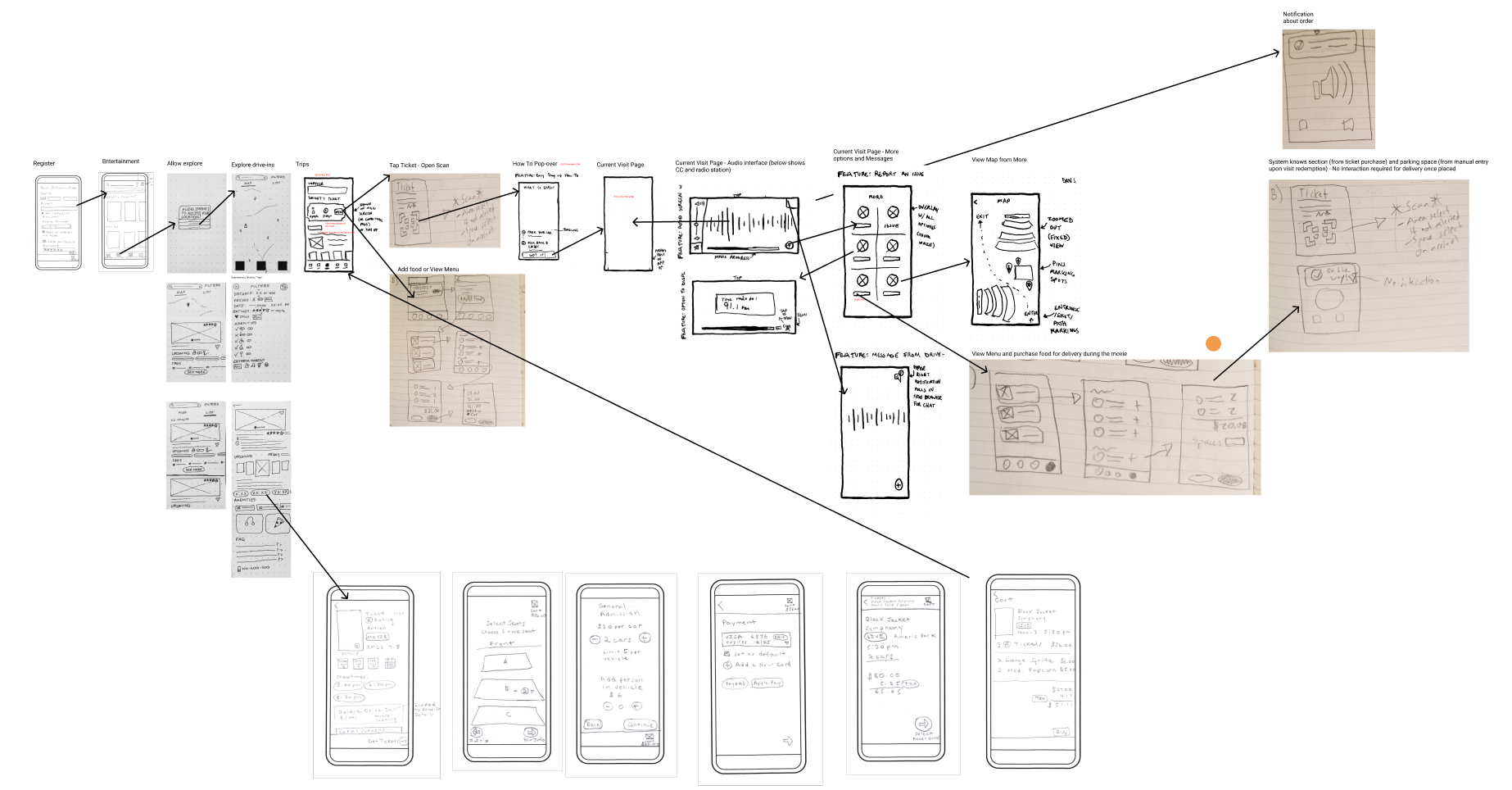
As a group, we went through our sketches to review ideas. We used a dot voting method to decide which sketches and ideas we preferred in our app. Each of us chose a color dot and placed our dot to select the version of a feature we thought worked best. We explained why we liked each feature and why it would be a good choice. We also came up with suggestions for possible improvements to the features and user flow as we went along. Although we were voting on the sketches, there were still many concepts and changes discussed verbally from each that made it into the wireframes that were not in the initial sketch. This ended up being one of the biggest values of doing the voting exercise together. We then reviewed our selected sketches and walked through how users would navigate through our app. We put together our sketches in a map to visually show how the navigation process would work, as if it were a story.
Our final step at this stage was to create the actual low fidelity prototype. Each team member focused on the features and subject areas they had iterated on for their paper prototypes. We used a global style and component library we had developed to keep the wireframe simple and consistent, and used the rough, story-like user flow we had laid out to program the interactions.
06.-
Hifi phase
High fidelity prototyping (step 8)
To kickoff the high fidelity prototype, we diverged on our own time to generate ideas for what we could market as the brand for this app. With consideration to our personas and target market, we wanted to create an aesthetic that kept the retro feel but captured the essence of our app in modernizing the drive-in experience. Each group member did a mini style guide putting together at least one logo concept, fonts, and a relevant color scheme. We then came together to converge on ideas which led to a creative meeting where we grabbed bits, cut, and fine tuned each element until we had an overall concept we were happy to call CarFlix (admittedly, the name of the brand might not feel the most original, but we were quite pleased with our design system, logo design, color palette, and typography choices!). With an overall agreement on the direction of the brand, we split off work to prep our Figma file to prototype in high fidelity by creating text styles, color presets, and a library of shared components.
Before creating the prototype, our team discussed the low fidelity mockups together to look at areas to change. Each feature had a core area that we all agreed to adjust, as well as many minor tweaks that made sense to adjust or expand on. Additionally, because the high fidelity prototype would have more robust concepts, there were some components that were non-existent in the low fidelity that we were able to build out in the more finished product. See the image carousel below for a few side-by-side comparisons between low and high fidelity prototypes.
After iterating on the low fidelity ideas and creating our higher fidelity pieces, we met twice to converge on the high fidelity mockups to share ideas and continue to improve each other's work. As we went through these ideas, we made sure that the story our prototype followed was consistent, touched each core concept we wanted to introduce, and closed any gaps that may have been missed. Once our prototype was in a good place, I started on the video demos using Adobe After Effects. The video demos are clickthroughs of the prototype on a mobile device, with subtitles explaining the story of Lindsey Cunningham's first time experience in the app, as well as her visit the day of the show. You can view both videos below. Make sure to have your sound on!
07.-
Research
Usability testing
Although additional usability testing was not included as part of the rapid contextual design process requirements, my group and I wanted to validate that the high fidelity mobile app we had produced really served users’ needs. We were especially curious about how well our app served users who fit personas beyond the primary persona we had defined. As a result, we ran simple, think-aloud usability sessions with 8 users that fell into either our primary, secondary, or supplementary persona groups. We mainly focused on qualitative thematic analysis to uncover common pain points. You can find slides with suggested improvements based on this research below.
08.-
Impact
Impact & conclusion
Even though this could be considered a “blue-sky” UX project due to the lack of technical and business constraints, we still learned a variety of valuable lessons about practical application of the contextual design process in real-world problem spaces. We were able to deliver our entire project website, assets, artifacts, mobile screens, and presentation on time and to our professor’s satisfaction and excitement, who even connected us to the startup lab on campus because he was so pleased with the thorough nature of our process and solution. (We haven’t had time to build our startup yet, but maybe you’ll see CarFlix on the app store someday!)